Huh? No clue? Don't tell me you have not heard of Benny? The western food Benny which has a stall in Maxwell Hawker Centre? Well, they have branch in Toa Payoh and it is in a coffee shop somemore!
For the benefit of those who have never heard of Benny, let me do some explaination.
Well, I was at maxwell months ago and saw this western food stall with bright yellow sign board at Maxwell centre. I thought I have saw the same shop in Toa Payoh before. Their signboard was often decorated with lots of recommendation from the local press and even foreign magazines but somehow they (the Toa Payoh one) are quite deserted like no one buy from them like that.
I mean their food should be of some standard if there are that many recommendation and good review from the press. I decided to give the coffee shop stall a try and see if they are really that good.

Benny's signature bright yellow signboard lined with good reviews from the local press and foreign magazine.


I stood in front of the stall for like 5 mins to figure out what they are selling. Ok, I am indecisive by nature, but this time round, it is not because I cannot make up my mind of what I want to eat. Their menu is messy. Small wordings and pictures arranged all over the place distracting people. The food categories arrangement is also weird. They arranged the spaghetti first, followed by soup and then by main courses and then side dishes and dessert.
Benny, if I may comment, eating at hawker centre is very different from restaurant. People want to get their food fast especially for lunch time rushes. If they do not know what you are selling within 1 minute, they will just walk away. I thought Benny should re-arranged the menu in a way that their star dishes are placed up-front which is their main course, followed by spaghetti. Also, their menu and signboard should focus on their food and not those good review articles. It is a bit absurd that customer can read lianhezaobao says the food is how nice and how nice, but not knowing what you are selling from first look.
Their lambshanks had not priced and customers had to asked about the price. It is not very advisable to put there market price because it define expensive. Usually, only crabs or seafood are stated market price in hawker centre and they are expensive.
So is that food nice?
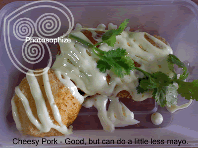
I ordered, after much processing, their cheesy pork which cost $6.90 and a tiramisu $1.80 to go. Food is prepared much slower than usual hawker stall, but they packed everything meticulously. Went home and open up the plastic box, it still looked neatly arranged and smell nice.
Cheesy pork is pork cutlet with cheese and ham fillings. It was fried to crispy golden brown outside, topped with lots of mayonese sauce. When cut open, pipping hot melting cheese flow out of the cutlet like molten lava. Took a bite, the meat is surprisingly tender and juicy still. It is not too salty despite the cheese and ham filling. This is not a easy dish, because people tend to over-cooked the pork that it tasted dry when done. I have eaten it a few times from somewhere else and all of them failed.
Their mash potatoes side dish is also nice and very presentable. It is a mash potatoes shaped into a ball fried with bread crumbs till goldbrown. I am surprise that it was not too oily which mean that they fried it at a good temperature.
The only thing that I have with the food is that it is a tad too creamy/rich for me. The apple colestraw is also very creamy, but has a tangier taste unlike the sweeter version which we are used to. The next time I am going to ask them to put less of the mayo sauce.

The tiramisu is also another looks can be deceiving food. Honestly, it looked very plain like frozen cream cheese. I even regretted ordering it. However, when I had the first taste, it was heavenly! I can taste the nice coffee flavour with a slight bitter chocolate after-taste. There is also a small piece of chocolate cake in the middle soak with more coffee.
Verdict:
Definately go try their food, because it is nice.
However, Benny I think room for improvement on your menu presentation and signboard design. The yellow is eye-catching, but with a stall named Benny, it does not explained what you sell. Even when your main focus is western food, it doesn't meant that you can sell french food with itallian food. Good review can only take you that far and attract that many customers, eventually your food is what makes your customers patronise again and again. So, please use bigger fonts for your menu and not those reviews in fact get a proper designer to do it for you. It is very cluttered and divert customer's attention away from your good food!


1 comment:
Great Post! It's very nice to read this info from someone that actually knows what they are talking about.
Design business signs USA
Post a Comment